MAPSEARCH REDESIGNED

Goodbye, Old Friend
We’ve changed a lot in the past 15
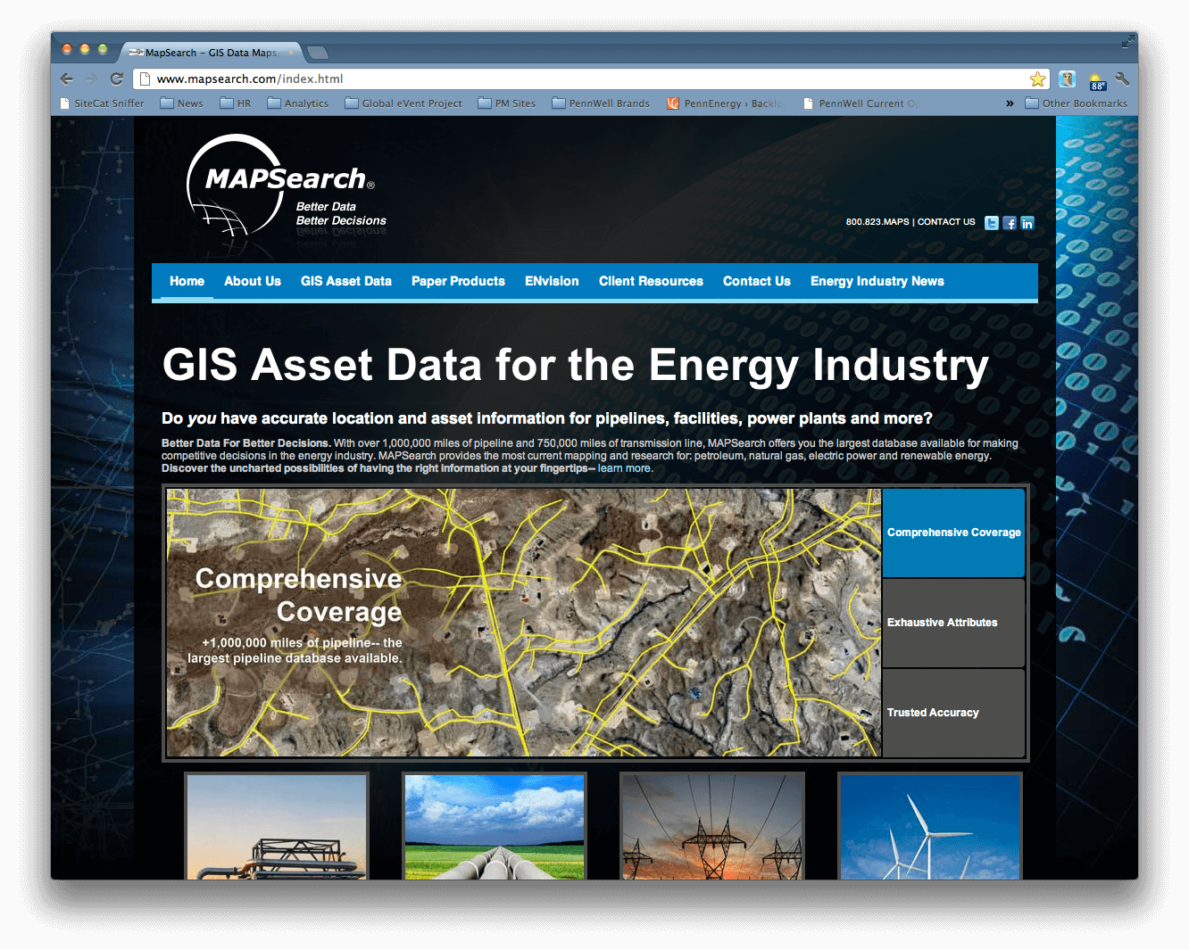
but you wouldn’t have known it from our website. Perfectly optimized for Windows 98 and dial-up modems, MAPSearch.com was like Pompeii: frozen in time. Sure, the content changed a little here and there. For instance, we added the token social media icons, which linked to accounts that were suspended for inactivity. However, the core design: a dark, brooding background with abstract globe composed of a Matrix-style digital code theme and a standard horizontal navigation bar floating above a multi-column layout, stayed the same. Indeed MAPSearch.com served as a consistent beacon of familiarity: nostalgically hearkening back to a simpler time amidst an ever-changing digital world.
 It is said that all good things must come to an end. And, so it was with the iconic image of MAPSearch.com. Like the “House that Ruth built,” Yankee Stadium, the design of our website had long outlived its usefulness and therefore into AOL, and typing http://www.mapsearch.com into the URL bar of their browser. For these nostalgic folks, the eleven minutes spent waiting for the homepage to load only helped to build their anticipation as a blurry image of the latest pipeline wall map slowly emerged. Terms like “responsive-design” and “search engine optimization” mean little to these people. Those are just trendy buzzwords of the “Me Generation.”
The debate raged on. There was shouting and picketing, and more than a few bruised egos, but in the end, it was decided: MAPSearch.com would be redesigned to address the needs of a more demanding audience. The struggles we endured from that day forward are numerous and the tales, not for the faint of heart.
But, this story has a happy-ending. For we stand here today, triumphant and sharing in the pride of our achievement. So, without further ado, allow me to present the New MAPSearch.com!
Enjoy.
